10 Must-Haves of a Successful Wine or RTD Product Landing Page (+ Examples)
Need help creating a product landing page that converts? We'll share the key features of a successful product landing page and top examples.
Need help creating a product landing page that converts? We'll share the key features of a successful product landing page and top examples.
In a category where shelf space is limited and digital discovery is booming, your product landing page can make or break a consumer’s decision to try your wine or ready-to-drink beverage. Whether you're launching a new vintage, promoting a seasonal cocktail, or simply trying to stand out in a saturated market, a well-optimized landing page acts as your brand’s digital storefront, and it needs to work hard. In this guide, we’ll break down the essential elements that turn casual browsers into loyal customers.
A product landing page is a dedicated web page built to spotlight a specific wine or RTD offering, whether it’s a new seasonal release, a core varietal, or a limited-edition cocktail. Its main purpose? To inspire action. That might mean a direct online purchase, or guiding the consumer to a nearby store, bar, or delivery service where they can find your product.
Think of it as a digital tasting room: a space where consumers can explore tasting notes, product details, and your brand story all in one place. A well-crafted product landing page acts like your most persuasive salesperson, helping shoppers make informed, confident purchase decisions.
Unlike lead-generation landing pages that focus on collecting emails or nurturing long-term interest, a product landing page is built for immediate conversion. Its goal is to drive action: buy now, find near me, or shop online. While it might still collect email signups or offer newsletter opt-ins as secondary goals, the primary purpose is always to move the customer closer to trying (and loving) your product.
Learn more: Landing Page vs. Product Page: Benefits of Each Explained →
Creating a product landing page that actually drives conversions means combining brand storytelling with frictionless functionality. Below are the essential components every wine or RTD landing page should include.
The quality of your landing page should reflect your product. Use high-quality bottle shots, elegant pour visuals, or lifestyle photography that evokes your target vibe. Many wine and RTD brands choose photography reminiscent of a casual rooftop happy hour or a rustic vineyard picnic.
Across all landing pages, remember that consistency is key. Match your color palette, typography, and logo usage to your overall brand identity. A well-designed landing page doesn’t just present a product—it makes visitors feel something about your brand.
Tell the story of the product in a way that’s sensory and succinct. For wine, highlight tasting notes, grape origins, and food pairings. For RTDs, lean into the experience: Is it refreshingly tart? Crisp and botanical? Weekend-in-a-can vibes?
Avoid long, dense paragraphs. Use short, emotive copy that speaks to your audience’s lifestyle as much as their palate.
Social proof includes reviews and testimonials from verified customers who have tried and loved your product. Studies have consistently shown that positive reviews are powerful in converting sales. Customers will only believe so much of what a brand has to say about their product, but can be quickly convinced to make a purchase (or not) based on other people’s experience with the product. Ask for testimonials from some of your key customers, or install a review widget that automatically pulls your Google reviews directly into your landing page.
Your CTA should make it incredibly easy to take the next step. Whether it directs your customers to find the product nearby, add to cart, etc., the next step should be clear. Make sure the button stands out visually, appears early on the page, and repeats as visitors scroll. Reduce friction—one tap should get them where they want to go.
A huge percentage of wine and RTD discovery happens on smartphones—often in the aisle, at a tasting, or mid-scroll on Instagram. Your landing page must be responsive, fast-loading, and thumb-friendly. Prioritize large buttons, short copy, and clear visuals that look great on a small screen.
Because wine and RTDs are alcohol products, don’t forget compliance. A simple age gate at the site or page level is usually required. You’ll also want to avoid language that could be interpreted as targeting underage consumers. Stay compliant while still offering a smooth, brand-aligned user experience.
If your goal is to drive in-store or local purchases—a common need for wine and RTD brands—a product locator is essential. It bridges the gap between online interest and real-world availability, helping customers find your product in nearby stores, restaurants, or delivery platforms.
An effective locator should be:
The Grappos Product Locator checks all those boxes—and more. It integrates smoothly into your landing page without disrupting the user experience. Even better, our team handles all backend data management and customization for you. No new software. No steep learning curve. Just a seamless way to help your customers find and buy your product, wherever they are.
Request a Product Locator demo →
Learn more: How to Add a Store Locator to Your Website →
Once you’ve hooked a visitor with one product, why stop there? Smart landing pages for wine and RTD brands often include a “You May Also Like” or “Pairs Well With” section. These curated recommendations keep shoppers engaged and increase average order value by highlighting complementary products.
For example:
These recommendations also help introduce visitors to more of your catalog, even if they arrived through a single campaign or ad.
If your brand offers direct-to-consumer sales, don’t miss the opportunity to promote subscriptions or product bundles. Many wine and RTD drinkers love the convenience of regular deliveries or curated packs that remove the guesswork.
Whether it’s a monthly wine club or a customizable RTD sampler, offering flexible bundles gives customers more reasons to come back—and helps turn one-time buyers into loyal fans.
Consumers are increasingly conscious about what they’re buying, seeking out as much information as they can before making a purchase. A great brand and a better landing page will provide as many answers to customer questions ahead of time, usually in the form of a frequently asked questions section. Though not every product necessitates an FAQ section, adding one to your product landing page can be extremely helpful in persuading customers to buy your product.
Learn more: How to Create an Effective FAQ Page for Your Brand →


Check out these product landing pages to use as inspiration when designing one for your products.
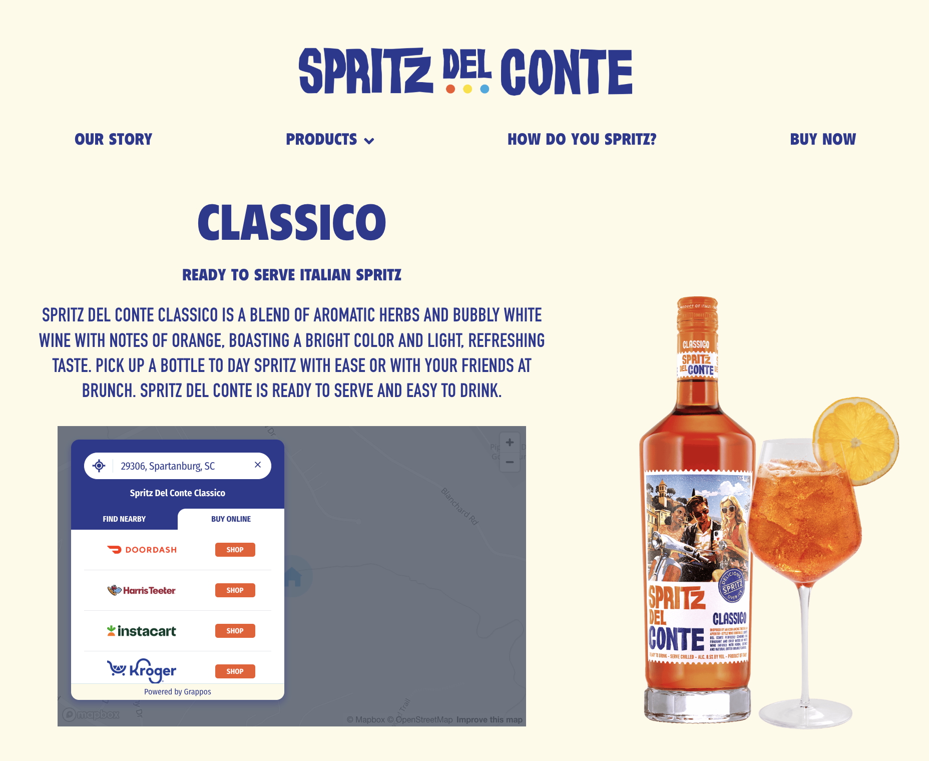
The product landing page for Spritz del Conte Classico is a terrific example of how to integrate the Grappos Product Locator directly into a product landing page. The page creates a seamless path from product discovery to purchase. This execution highlights several hallmarks of a high-converting landing page, including brand-forward design, mobile responsiveness, and a frictionless locator experience that guides customers toward action.
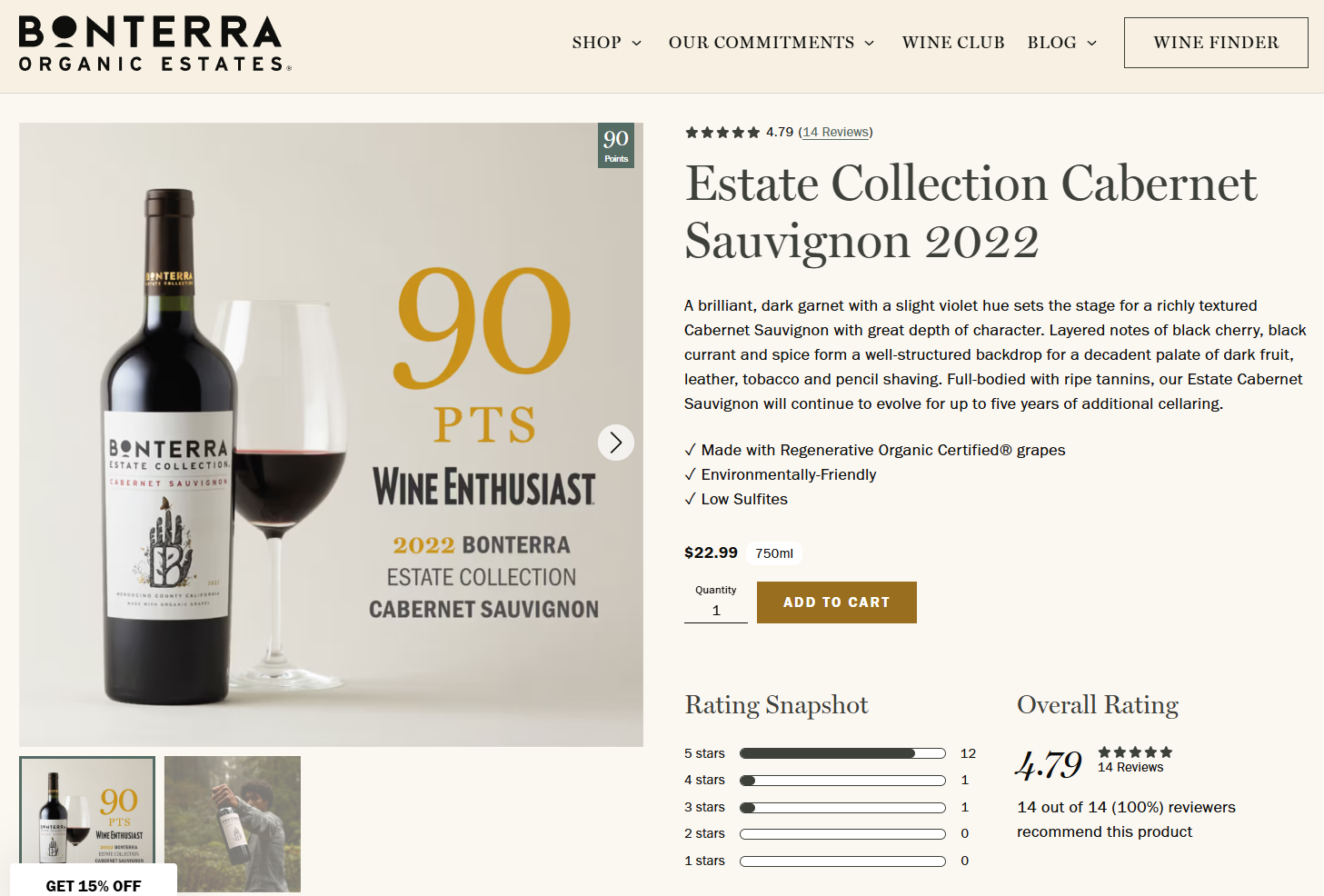
Sustainable winery Bonterra showcases a masterclass understanding of a successful product landing page. In addition to high-resolution images and crisp graphics, visitors also see awards and accolades, customer reviews, and a brief but thorough product description.
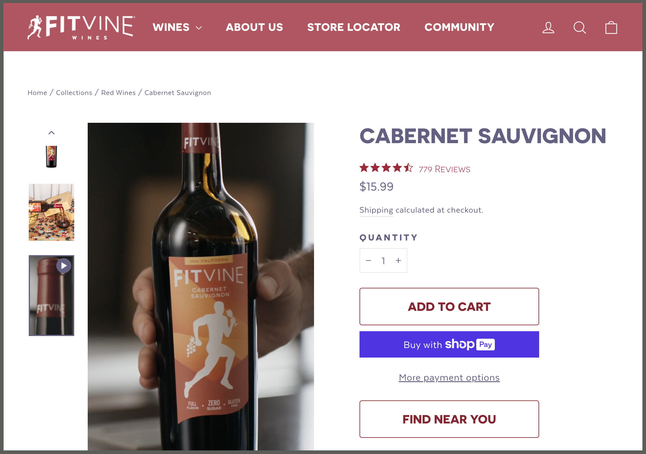
With punchy headlines and concise copy, FitVine Wine crushes the product landing page game. Made for health-conscious wine consumers, FitVine also includes crucial health information directly on the product landing pages so customers know exactly what they’re getting with each bottle. A review widget near the bottom of the page provides social proof and insights from confirmed buyers, adding trust and providing confidence to first-time buyers.
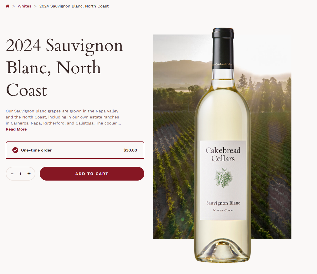
Cakebread Cellars is the perfect example that sometimes less is more on a product locator page. This deceptively simple product landing page communicates quality and elegance with its clean design and crisp, sun-drenched photos. Scrolling down, visitors can learn more about the wine itself and see related products tailored to their interests.
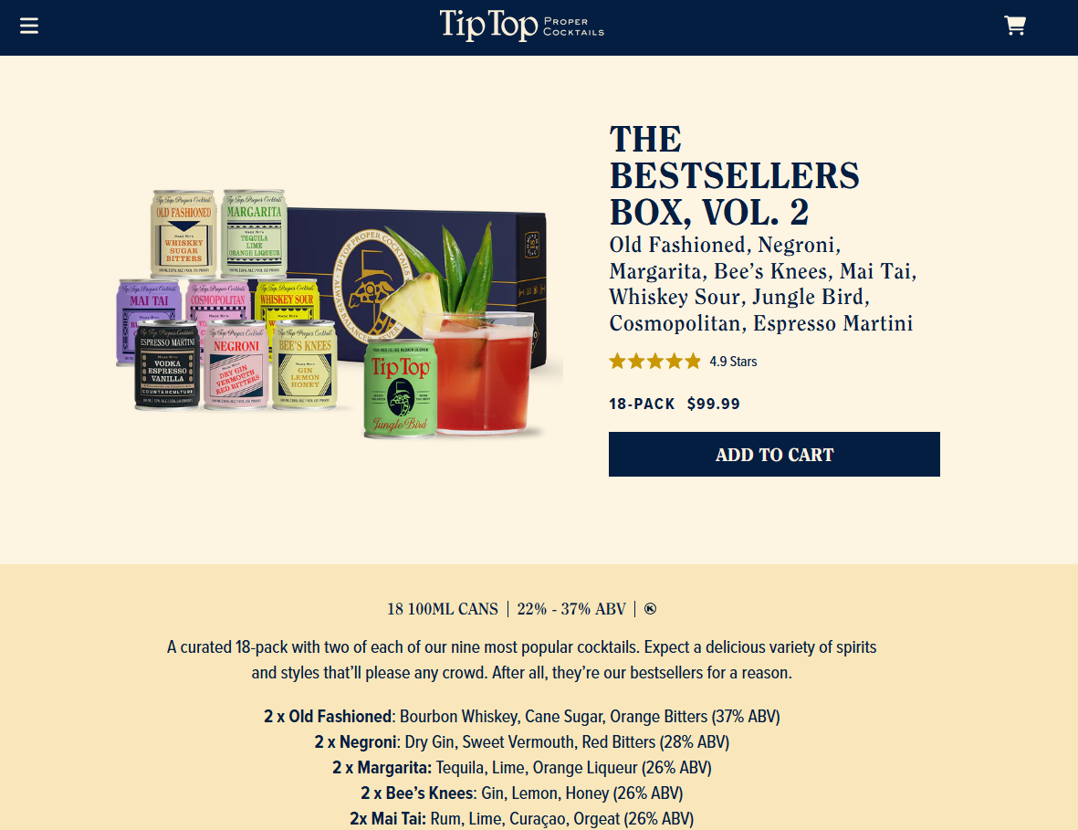
Tip Top’s RTD landing pages combine functionality with punchy copy and a vibrant design. Striking visuals, standout awards, and clear calls-to-action make it easy to explore, shop, or find a store. What Tip Top Cocktails does best, however, is the social proof. Their review widget is thorough, allowing confirmed customers to leave their genuine thoughts and pictures of the canned cocktails they’re enjoying.
A great landing page connects, converts, and builds trust. For wine and RTD brands, this means combining beautiful design with smart features, such as a product locator, compelling copy, and cross-selling opportunities. Whether your goal is driving in-store traffic or direct-to-consumer (DTC) sales, these best practices will help you craft a landing page that drives product sales and fosters brand love.
Ready to make your product easier to find and buy? Discover how Grappos helps beverage brands like yours power high-performing landing pages with seamless product locator integration.
Request a Grappos demo today →
You might also like:


